 I came across this painting and thought others might like it, too. I am not sure why I like this picture. If you don't just click away from my post. If it catches your fancy or delights you, then try to explain what it is about the image that evokes your response. Enjoy.
Subscribe to:
Post Comments (Atom)

8 comments:
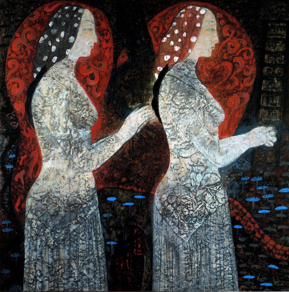
hmmm. first impression, I thought of the virgins with their oil lamps.
then I looked more closely.
they look very somber.
personally, I like more colour in paintings. I am particularly fond of primary colours in painting, which probably explains my love of Coptic iconography.
but it's a good picture.
That is totally what I thought of Vic. I wonder why we think that?
I thought maybe the red behind it revealed a conversation
Light seems to be radiating from their bodies. And, as well, there seems to be a sort of sisterly warmth between the two figures, even though they are not facing each other. Rather, like people at prayer, they face in the same direction. Also, I like it because the woman on the left appears to be reaching out to the woman in front - perhaps in a gesture of healing or consolation. I'm with you, Thomas, this is a very beautiful image.
Lovely. I actually love almost all procession-type images, ancient and modern, and plan to do some of my own someday -- I am totally spellbound by the image of processing clergy viewed from the side. I was struck by that initially at a St Vlad's Paschal service when they were all in white vestments with dark hair and black shoes -- it was amazing; almost abstract but not quite-- someday.
So, your image, in point form:
-evocative of classical fresco (Pompeii, Rome, Crete, etc) -- always a good thing
-- the hands are beautifully DRAWN -- good drawing is the prerequisite to a good image. Many amateurs try to cut corners and go straight to the fun colour/pretty part, resulting in abysmal boneless boring figures. This just avoids that -- mainly by the fine drawing of those hands. What is accurate is always more beautiful. As Ruskin says,works of great and good art all have this in common: it is all delicate art. I think this applies to nonrepresentational, absolutely contemporary art as well as earlier forms: the mark of quality, of validity,if you will, is delicacy and truth. Please understand this does not mean /pretty/ or /understandable/ or anything like that, in my book. Just that there is intention, theory,love, and perhaps above all, craft.
--hieratic -- it has lots in common moodwise with iconography. Dignified, modest. Women shown upright, wise, quietly focused. The very opposite of the images of women with which women are insulted every day at the grocery store tills.
--nice dots on the veils. Dots are good. I also use that trick -- stars, flowers, anything to make dots. Eyes like them for some reason.
Well, back to work! Keep up the cool posts. I'm on an art theme right now too. Trying to post modern artists' writings to show they were not /all/ degenerate bastards! Or at least, not all the time.
Who is the artist?
totally dug the post about vegans Thomas, good thoughts.
You're right. Beautiful.
Where did you find it?
Post a Comment